Thursday, 1 October 2015

Summary of conventions


The front cover of a music magazine uses a plug to bring in readers however some magazines use the plug in a different fashion such as this one which places it at the top, making it the first thing you see when picking it up.
 As well as using a plug at the top they use a skyline just below it,which has another feature story. The magazine name is then placed below that so the plug is the first thing you see that could bring you in and then a feature story featuring a big name artist followed by the name of the magazine, this then places the potential selling points above the title to draw in new readers. The front cover then also has a world exclusive on the main image which is another plug. Below this there is the main story and the feature stories which stand out on the main image. The term "world exclusive" is a term usually found on magazines to make the magazine seem unique and to grab the readers attention when they pick up the magazine.


The contents page uses a wide range pictures of several artists and summary of all the stories found in the magazine. Many contents pages contain a message from the editor to the reader making it a common convention. With the magazine in question this is what their contents pages normally look like:

 
The convention seen with the metal hammer magazine is that they always feature a girl at the bottom of the page in stereotypical metal fan fashion. This due to the majority of the audience being male. Another convention of these magazines is the split between regular stories and feature stories to make some stories easier to find for the reader. Most of the page is taken up by the pictures of artists with the page number attached, making it even easier for readers to find certain artists.
 
For the double page spread they normally look like this:


The picture normally takes up one page while the interview takes up the other one. This is a common convention of music magazines as are the quotes from the interview/story that are enlarged and focused on. The main title of the story is normally the biggest writing on the page followed by the quotes from the interview/story. The double page spread picture has the person in question looking at the camera while sitting and looking tough/aggressive. This is to fit in with the genre and to make the artist look gritty and edgy. He's sitting on a throne to imply he's a king because of the fact he's been in the business for a long time, this adds character to the picture rather than just have him standing looking at the camera. 


Conventions analysis double page spread


Continuing with metal genre this double page spread features a well known band that the readers would be interested in reading about. With this double page spread, half the page is covered by a picture of a band member. The clothes he's wearing show the style of the genre and the magazine as does the skull he's standing on. As mentioned before the magazine is made by a company that also makes a rock magazine. So the band focused on here would be a bigger focus in this magazine as they are a metal band rather than just a rock band. The interview with band let's fans of them know about what happened to them and what they're going to do next. This means its need was to inform fans of the situation at the time and it fulfils that need. As mentioned before, the font suits the style of the magazine and the genre and sometimes used with the band featured.   

Conventions analysis contents page


The colour scheme is the same as seen on the front cover, which keeps with the colours that are associated with the stereotypical readers of this magazine. Also the pictures shown and the overall style of the font fits the genre it's representing which is heavy metal. The type of people that read the magazine are represented by some of the pictures used in the contents page. These pictures are also of the featured stories and these can peak the interest of the reader which is what the contents page is used for. What a contents page has to do is to list all the stories in the magazine and to summarise what the story will contain to make it easier for the audience. The use of the rock hand symbol also represents the metal and rock genres and therefore shows how metal fans are represented. The contents page also shows regular stories and the feature stories, making it easier for readers to find the artists they want to read about.

Conventions analysis front cover & brief

Brief:

To design a front cover, contents and double page spread of a new music magazine. All images and text used must be original, a minimum of four images must be used.

Sky line also used as a plug. It is the first thing seen by the reader as the red colour stands out amongst the black main image.

Main image is black to suit the style of music it’s representing. The person in the main image is seen as attractive to the type of people that would read the magazine.

Feature story given a title in a different colour to stand out and show that it’s exclusive.

Main story is in white to fit the colour scheme with the black main image.

 
Footer is the same colour as the sky line to stand out and also shows the other stories feature in the magazine.
The media language of the magazine is to use the main colours associated with the metal genre which are red, black and white. This makes it stand out to people looking at it on the shelf and also the main image is used to attract the metal crowd, and in this case women in particular.

The ideology of the magazine is to show which artists in metal are popular at the time and to advertise them further. By doing this they can bring in fans of the artists to the magazine to read about what is currently happening gin terms of their favourite artist/artists.

Metal Hammer is a metal magazine published in the UK by a company called TeamRock. It focuses purely on the metal genre as well as sub-genres of metal. This means they don’t directly compete with rock magazines such as Kerrang as they focus on one genre in depth. TeamRock also focus on the rock genre but publish a magazine on metal to attract that specific crowd and focus on the talent in that genre.

The audience it focuses on is metal fans, both male and female however the majority of readers would be male. The magazine focuses on a specific audience so it wouldn’t attract many people from outside of that. This may limit their potential readers but this way more stories that this audience want to know about can be featured.

The metal crowd is represented by this magazine by the colour scheme it uses and what the person in the main image wears. Metal listeners are often seen as people who wear black, have long hair and tattoos. The person is represented in the main image in a way that he is seen as attractive by female readers. This is an example of the stereotypical metal listener.


Thursday, 24 September 2015

Evaluation

What have you learnt from completing this task?
During the task I learnt the conventions of a magazine and also how to use Photoshop effectively. Learning this will help me in the future in terms of media, especially with future work on the course. I also learnt the different types of shots that can be used such as the medium close up that was used in my front cover. I learnt the importance of each convention on a magazine front cover, even some of the smaller ones that have to be added such as a var code which can be easily over looked when creating the front cover.


How have you used technology? What conventions have you used and why?
Through using Photoshop I have learnt different techniques on how to use different tools for different effects. For the conventions I used the sky line and footer as they are frequently used on magazine covers for feature stories along with the other feature stories on the side. I used the main feature story as a convention and usually it is larger on the cover than the other feature stories. I added a bar code to the bottom to make it more realistic as magazines feature as bar code. Other conventions included are a plug to entice people to buy a magazine and the main image which is the first thing people see when looking at a magazine
 
What would you change if you were to do this task again?
If I were to do this again I would change the style of the magazine so the magazine then has a clear theme such as music or theatre. This way the stories can be focused more on a clear theme. Also I would change the overall colour scheme to better suit the main image so it doesn't clash with it. I would also use better feature stories and main feature to better suit somehting you would see in a weekly magazine. This is due to a weekly college magazine wouldn't use stories on revision and deadlines if it has been going on for a while as that would be the first issue and it would focus more on college news.


Wednesday, 23 September 2015

Photos for front cover

Moderate lighting, not too bright or dark, medium close up, nothing in background , will be used
Too dull, people seen in background, face is being pulled so will not be used
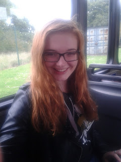
Lighting is off, bus setting doesn't seem to work for the main image so none of them shall be used.
Not medium close up as it shows below the chest plus bad lighting through the bus setting, will not use
Busb setting doesn't work becasue of light from windows, will not use
medium close up, good lighting, background setting is better, can suit a writing theme as subject is reading a book, definately a good choice, could be used, subject however not looking at camera
Not medium close up so can't be used plus subjec t not looking at camera plau lighting is less effective, can't be used
effective lighting and location, is medium close up, could be used
people seen in background and would be more effective if full wyke logo is shown rather than it being cut off, however setting does work, won't be used
location and background not very effective although it is a mdeium close up and lighting is good, Will not be used